
APA Pattern Library · Web apps
Organizing the ecosystem
Providing consistent and connected experiences for 130,000 APA members across numerous tools and resources.
Company
The American Psychological Association
Role
Lead UX Designer
Industry
Nonprofit
Type
Web apps
Challenge
Many of the web apps have inconsistent styles, which impacts the overall user experience and brand. This would cause confusion for users going in between different systems.
Results
Streamlined designer-development handoffs, faster prototyping, and more consistency across multiple apps for 130,000 association members.
130,000
100+
Foundation
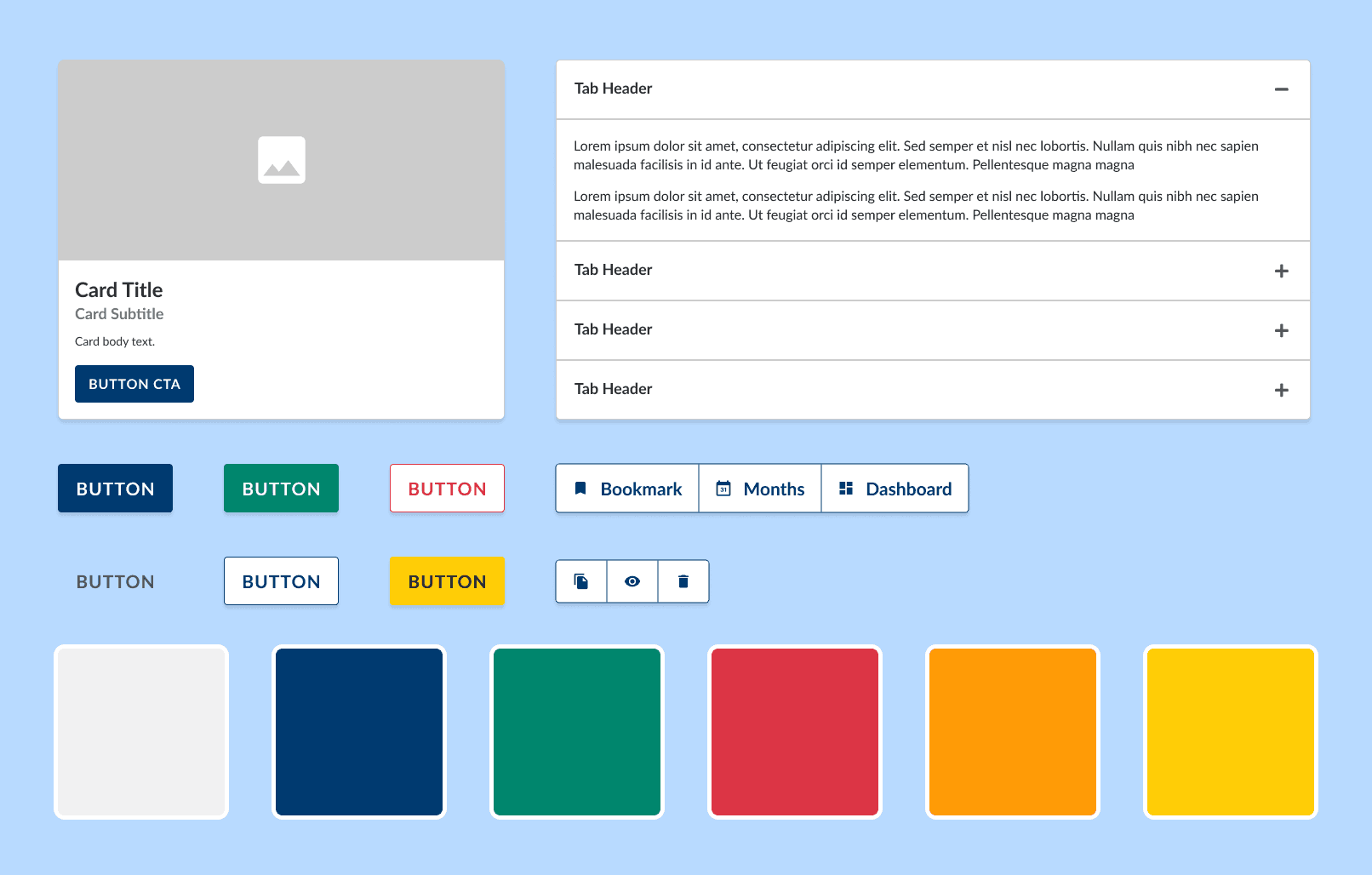
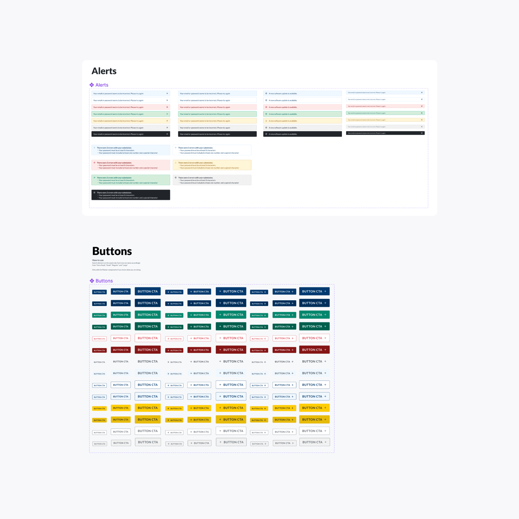
Using Bootstrap 4 as the foundation for the pattern library allows the team to focus on usability, accessibility, and styling. With a team of 2 working on many other projects, finding a quick way to get started was essential. Also, since the developers are familiar with Bootstrap, it is easier to hand off and translate designs.
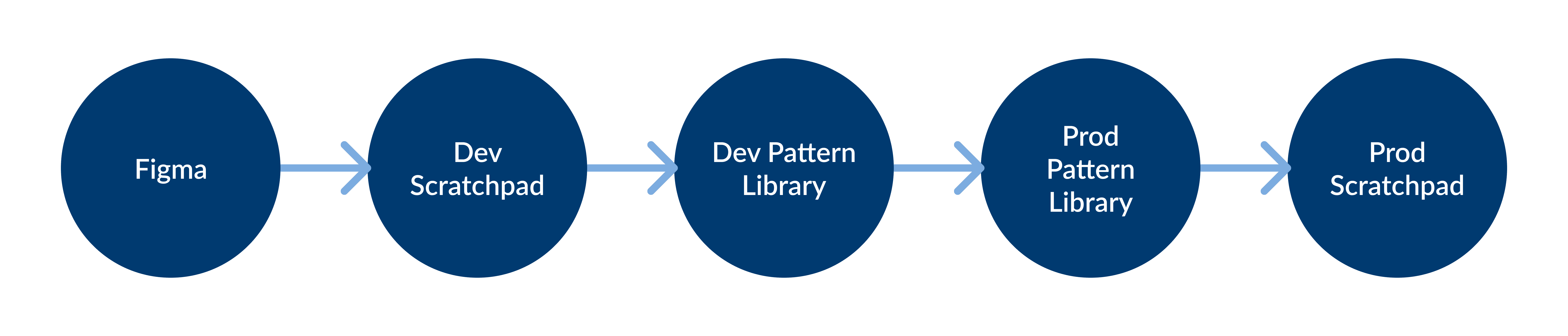
The pattern library has a dynamic stylesheet that uses SASS. When the styles are pushed to the production site, any app that references the same stylesheet will automatically update with the new/adjusted styles. This is very helpful for maintaining general styles such as color and border-radius. It helps to save time when updating branding elements.
Streamlining processes
As our team grew it was important to document a process with constant checks and reviews. The UX team would review the design and code before pushing changes live to the documentation site.
Conclusion
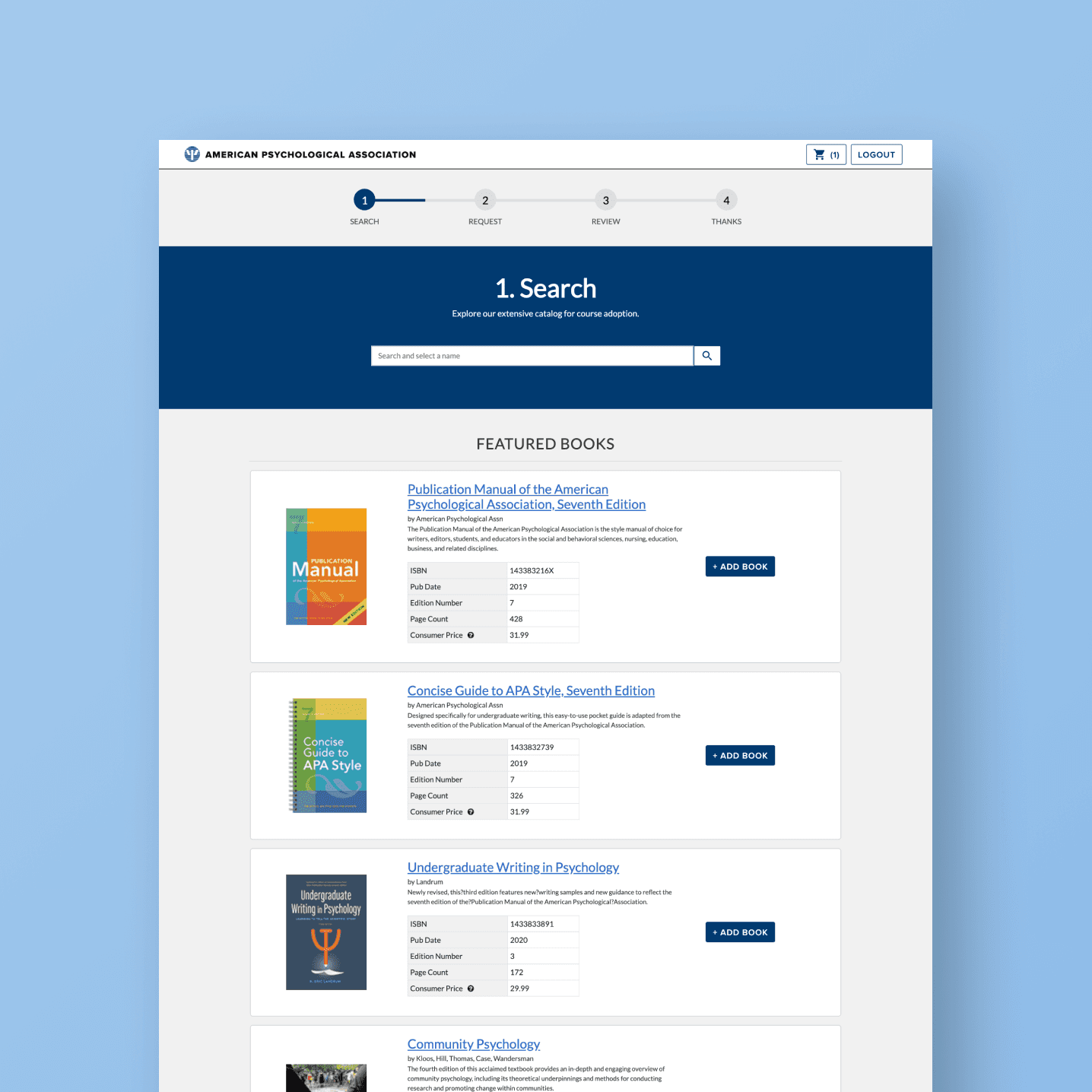
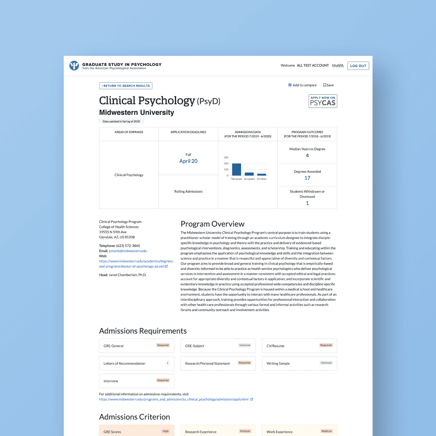
This is an ongoing project at APA that has been constantly evolving. When the UX team first launched the pattern library, we were focused on creating a list of components needed in most of the apps. The components are essential and have to be thoroughly tested and reviewed before publishing to the library. With pattern libraries, it’s important to not only focus on the styling, but the markup of the code. The quality of code can impact accessibility and usability. Since the UX team uses the library heavily for prototypes, we were able to find and resolve any issues that came up with the code.
Another important lesson our team learned is the importance of keeping the components simple. This meant we had to keep in mind that padding needed to be minimal since these components are meant to be versatile and exist amongst other elements on the page.
The pattern library for the web apps is consistently growing and improving. Testing and developer input helps to build a solid foundation for the apps as we continue to improve the user experience throughout the organization.
Within one year of the initial pattern library launch, the team has experienced smoother designer-development handoffs, faster prototyping and better aligned systems. Over time, we have consistently made steady contributions to the library, which helps us to focus more on the design problem.