
CareMessage Design System · B2B
Transforming healthcare with joy & empathy
Empowering health clinics to improve health equity in underserved communities through a vibrant and easy-to-use platform.
Company
CareMessage
Role
Senior Product Designer
Industry
Healthcare
Type
B2B
Challenge
CareMessage's adoption grew significantly during the COVID-19 pandemic. With CareMessage rapidly growing, we needed to reevaluate our UI components and prepare to scale.
Results
Reduced contrast errors from 110 to 10
Increased our accessibility score on Google Lighthouse from 74 to 87
Improved design-development handoff process
400+
Health clinics
90%
Improvement in color contrast
25%
Increase in accessibility score


Process
I took inventory of CareMessage's existing components and patterns, noting the most commonly used components, app inconsistencies, and usability improvement opportunities. I also reviewed customer-submitted feedback to understand and uncover user pain points within the app, which helped with component prioritization.
Systems thinking played a big role during discovery. I thought about how the design of individual components would work in different user scenarios and edge cases. Something that I noticed while conducting my heuristic evaluation is that certain inconsistencies within the app were due to simply thinking about one problem at a time. I dug deeper to understand and address root problems our customers were facing.
Before
After


Documentation
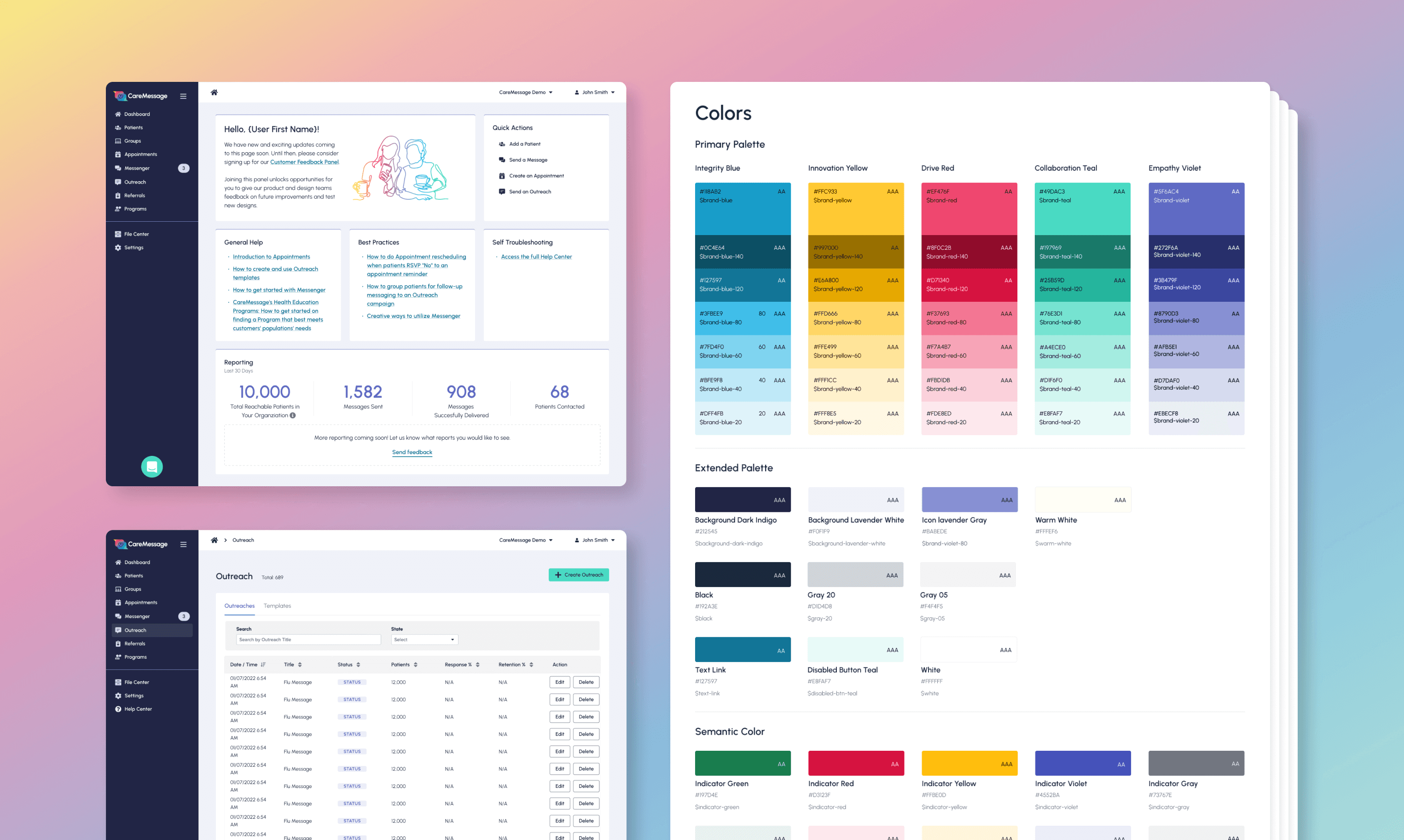
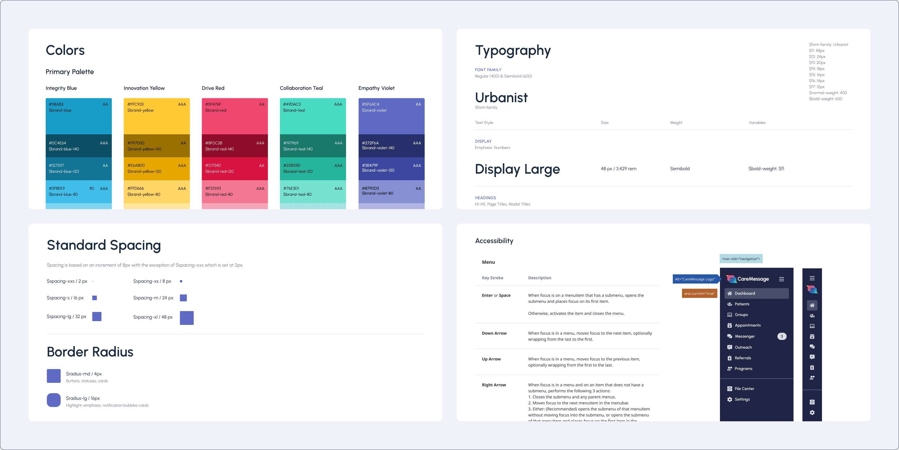
Establishing foundations: The core of the design file centers around foundational visual elements such as color, typography, spacing, and border radius. Our Senior QA engineer conducted an accessibility report to help us locate critical areas for improvement. This helped ensure accessibility was not an afterthought but built into the design system's core.
I tackled the following:
Including color contrast options for our brand colors
Setting typography hierarchy and sizes explicitly made for a highly interactive app
Defining consistent spacing and border-radius styling for a refined and polished product visual design
Utilizing an accessibility annotation library to help communicate accessibility requirements for various components within the documentation.
I organized the pages within Figma to help with organization and communicating structure for the documentation site. I documented best practices for usability and accessibility. A lot of the documentation created centered around the heuristic evaluation done in the discovery phase of the project.

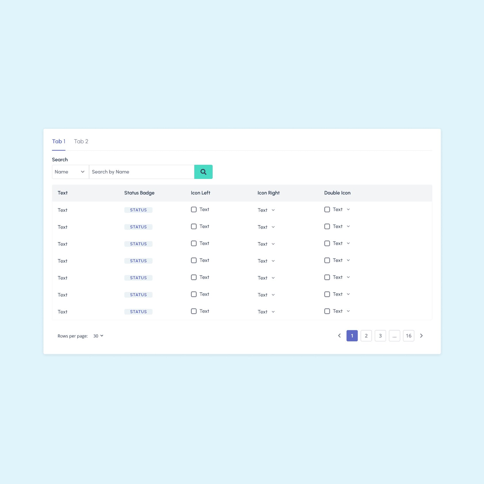
Setup: I created the components by using variants, instances, and autolayout. This helped make it easy for other designers to incorporate those components.
Leveraging Figma variants: This feature in Figma helped me create and manage various states and styles for particular components.

Button component in Figma
Creating placeholder content: While constructing the card, tile and modal components, I created placeholder content with the use of instances. The designer could then easily swap the placeholder with different content layouts for their project. My goal here was to give designers flexibility without disconnecting the instance. Once they disconnect from the instance, they will risk the file becoming out of date.

Tile content placeholder
Streamlining processes
The team created a dedicated slack channel with in the organization for any and all communication around the design system. People can easily raise questions or concerns within this space.
We used Zeplin to help with communicating design specs. We leveraged the global styleguide to communicate established components and sass variable names.


Conclusion
Here are a few highlights from the project:
Reduced contrast errors from 110 to 10
Increased our accessibility score on Google Lighthouse from 74 to 87
Improved design-development handoff process
In the future, we would like to start tackling template pages and building more complex patterns. The Product Manager of the design system team started working on a design system roadmap to ensure we continuously deliver new updates to the library. The engineering team has researched integrating with Storybook to help with documentation.