Academic Writer · B2B2C
Helping college students write, anytime and anywhere
Students were limited to a desktop-only version of Academic Writer, restricting their ability to write papers whenever and wherever they wanted.
Company
The American Psychological Association
Role
UX Designer
Industry
Nonprofit
Type
B2B2C
Challenge
Results
This project enhanced the app's usability on mobile and desktop, creating a new selling point and improving accessibility for students and their work. This helped improved user engagement.
Discovery
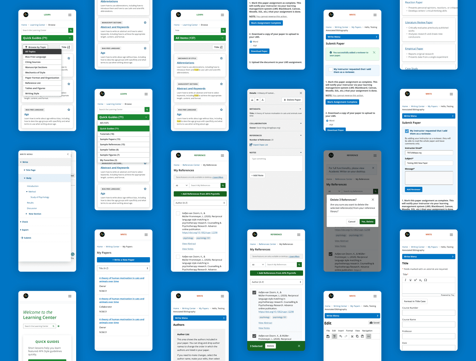
The UX team, along with the product and engineering teams, analyzed each section of the application: home, learn, references, and write. We relied on previous user research and a usability study conducted earlier this year. This effort involved a thorough examination of the current application to improve its usability. It also helped us prepare for the responsiveness initiative by creating a design that scales effectively.
Usability Study: In this study, I first pulled from an analytics report to see what the top pages and user flows were within the app. I then worked with product to create the study tasks to understand the following:
Could users easily navigate between the various sections of the app?
Could users easily perform the most important tasks within the top app pages?
I ran a remote unmoderated study with 16 participants. After analyzing the results, we were able to note 4 clear observations, which fell under a couple themes:
Cognitive Overload
Decision Fatigue
Highlighted enhancements
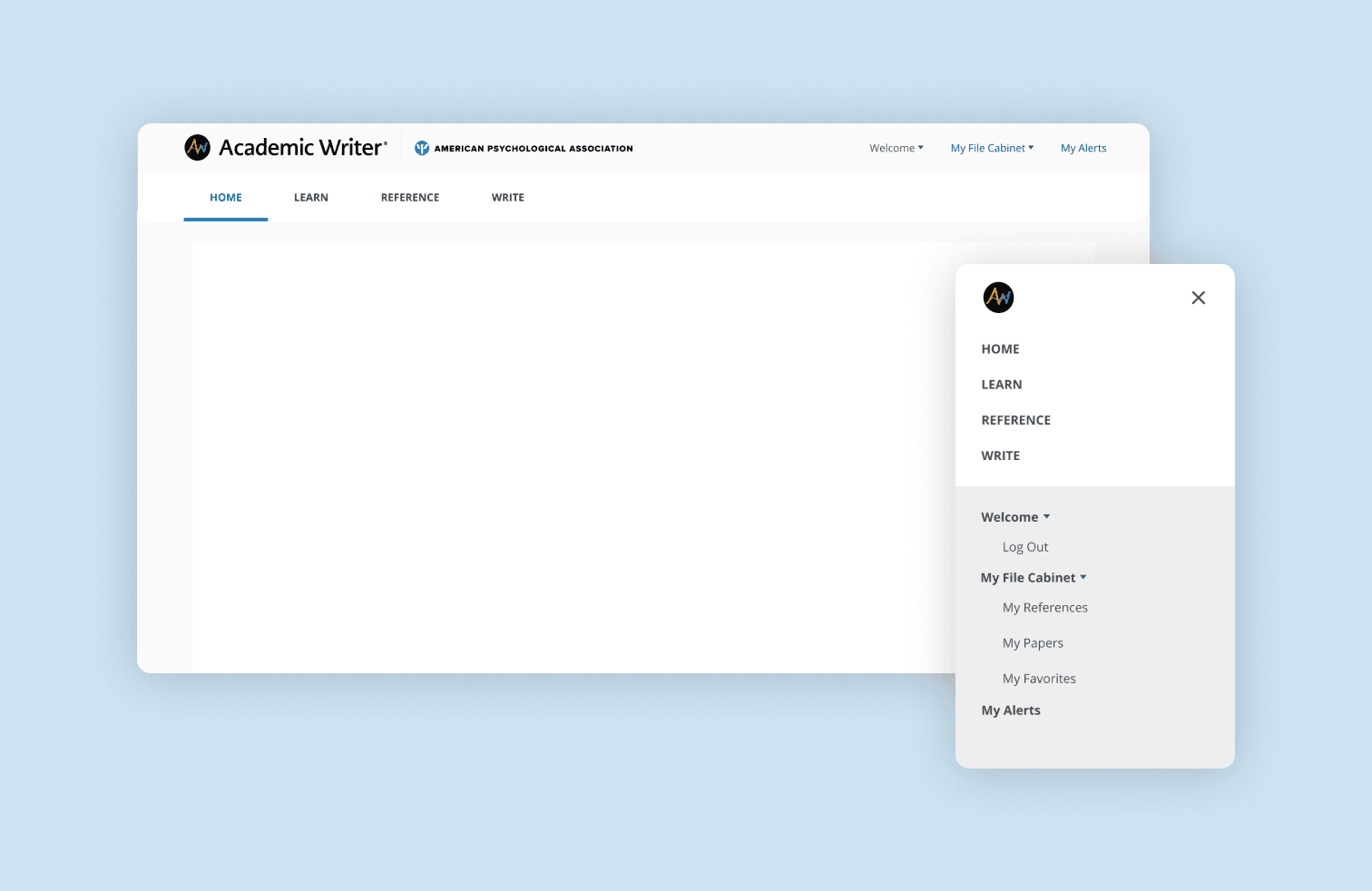
Improved navigation: Increased scalability of navigation by making it responsive.
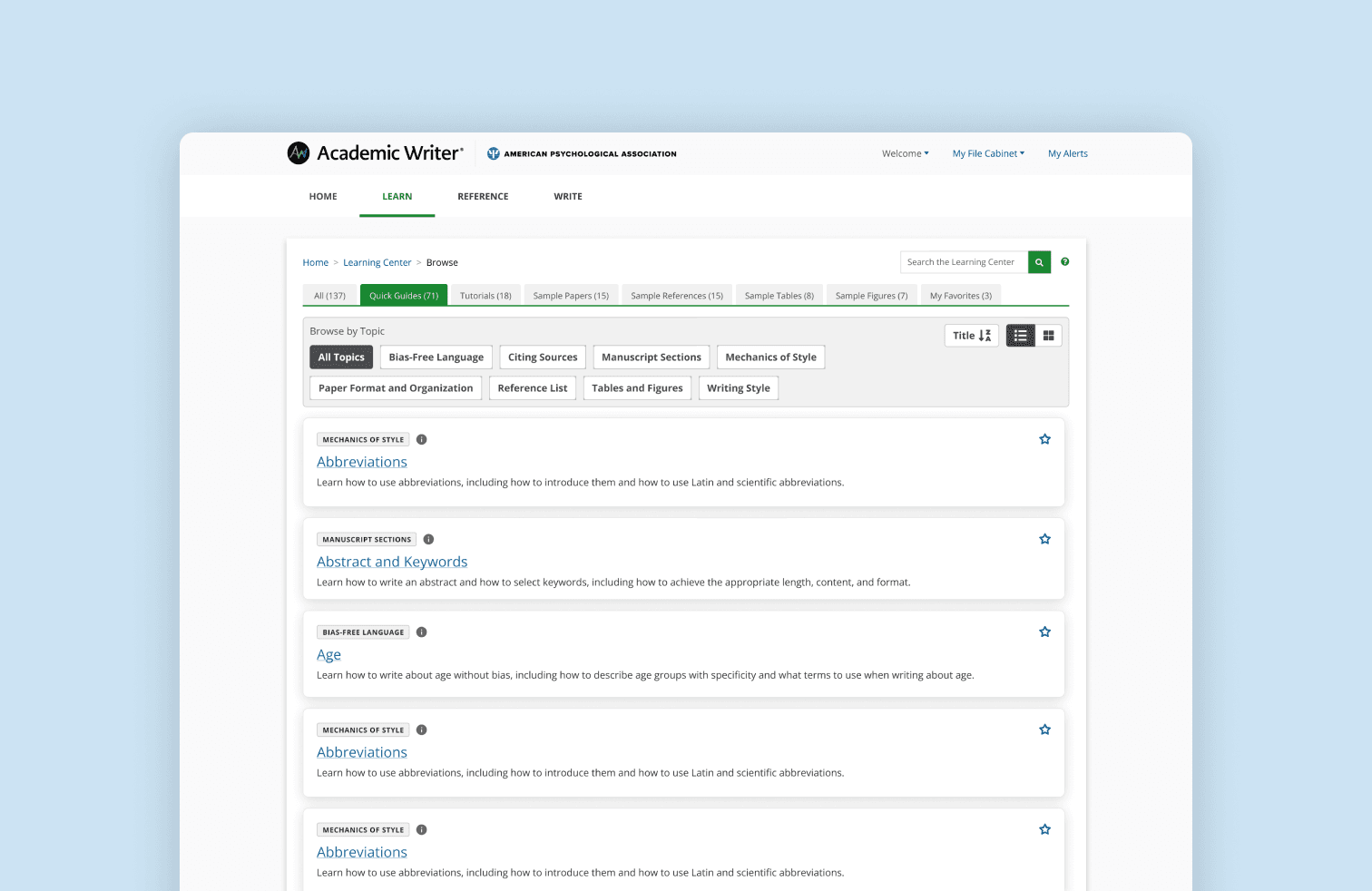
Learning Center: Improved discoverability of various lessons.
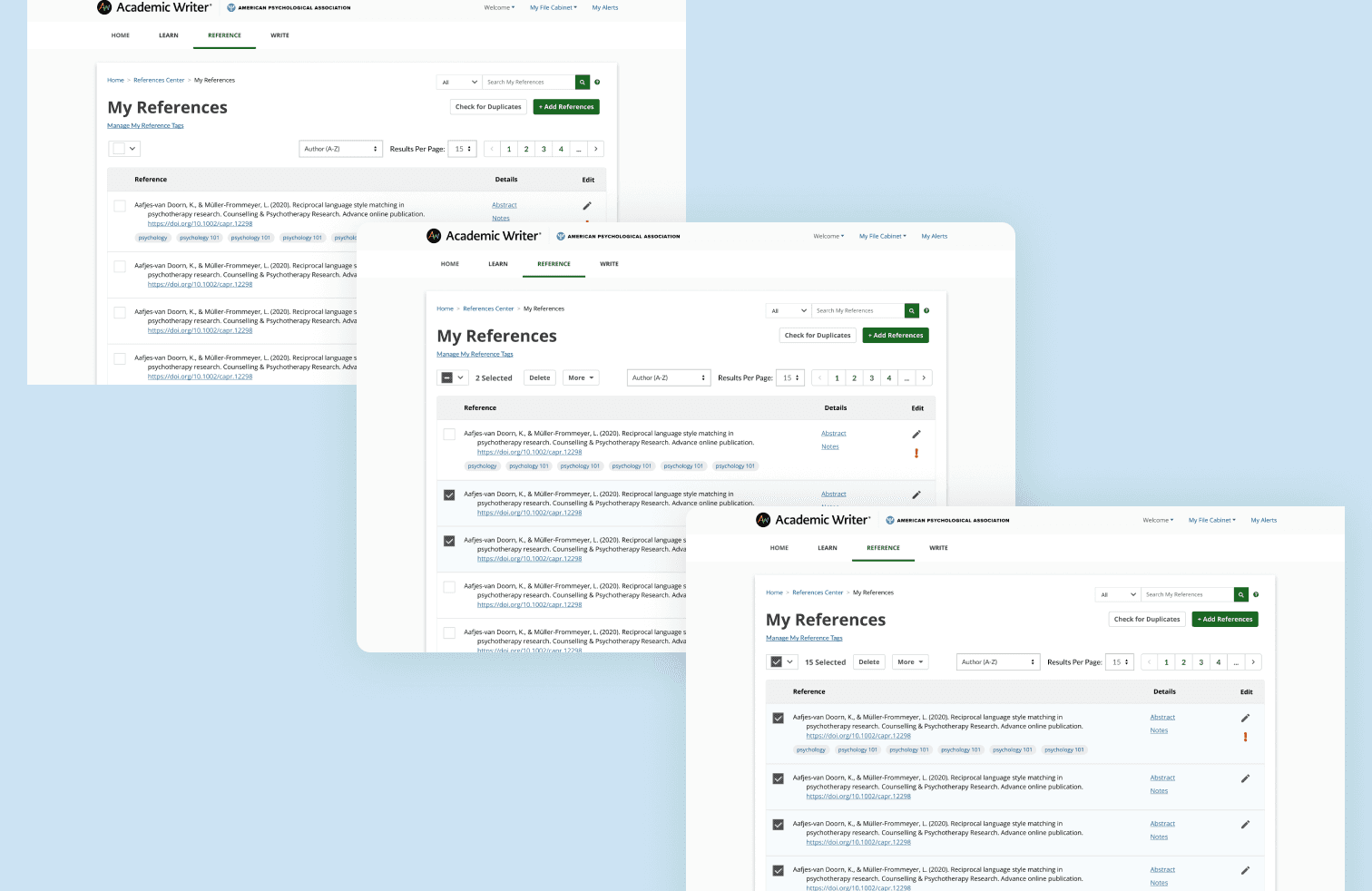
Reference Center: Improved bulk actions within a responsive table for easier data manipulation.
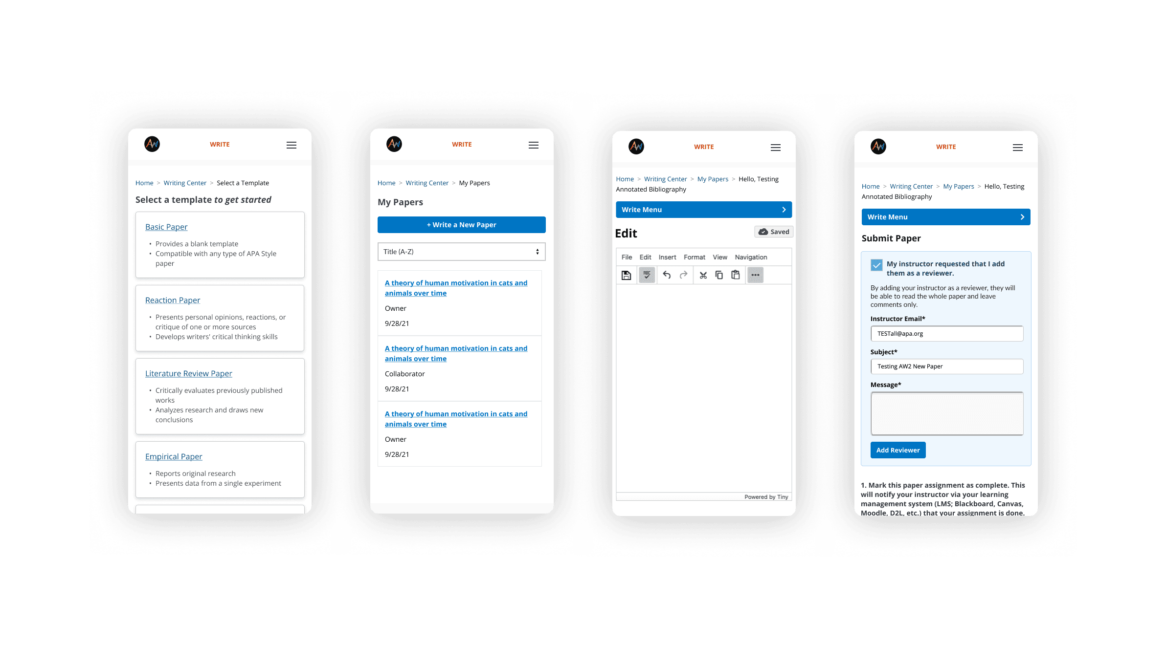
Write Center: Improved cognitive overload by reducing visual clutter.
Conclusion
This project helped improve the overall usability of the app and also helped prepare for making the app responsive. This provided a new selling point and helped make the app more accessible to students and their work.

