Graduate Study in Psychology · Online database
Increasing buyer confidence
Providing undergraduate students the ability to search and compare admissions information from over 500 schools for master's and doctoral psychology programs.
Company
The American Psychological Association
Role
UX Designer
Industry
Nonprofit
Type
Online database
Challenge
Stakeholders were looking to increase sales for the platform. To help identify current pain points and opportunities, the UX team ran a customer journey mapping workshop. We identified opportunities for the landing page to help conversions.
Results
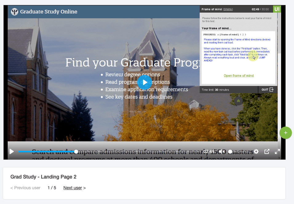
Revamped the Graduate Study in Psychology marketing website using combined findings from usability testing and user interviews, which led to a 50% increase.
50%
Increase in user conversions
Discovery
I participated in a lot of the processes to help with the new release of Graduate Study in Psychology, such as customer journey mapping. My key contributions to the project was creating the usability test, analyzing the results, designing the final mockup, and providing some CSS. This project was collaborative and involved working across different departments and teams.
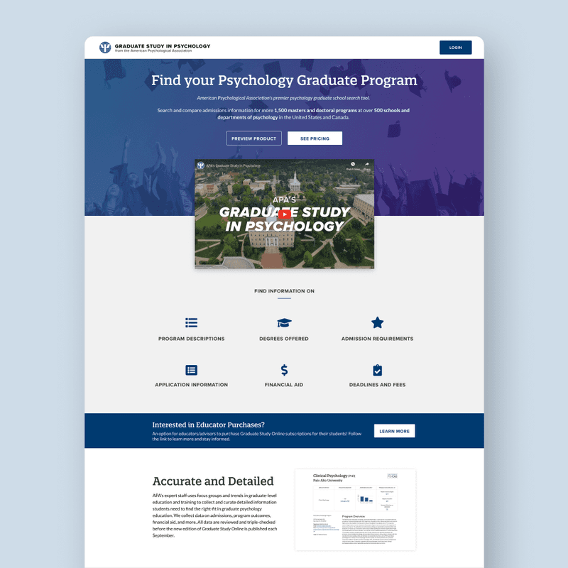
During the discovery phase of this project, our team set up a customer journey mapping session. After completing the workshop, one of the things we noted as a good opportunity was the landing page. Students can become overwhelmed when looking for a graduate program, and there are a few options for other tools. We also listed additional items that could be added to the landing page, such as testimonials, a marketing video, and a product demo. The landing page was one of the first steps in engaging with the site, and there was an opportunity to show the app's value. We focused our attention on the following question:
How might we increase conversions?
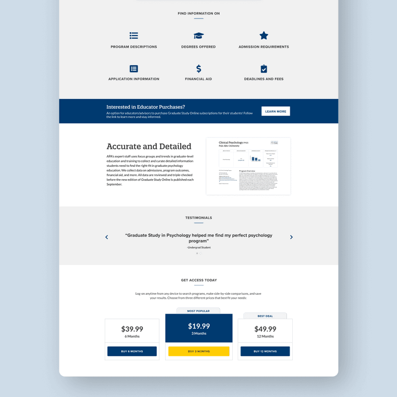
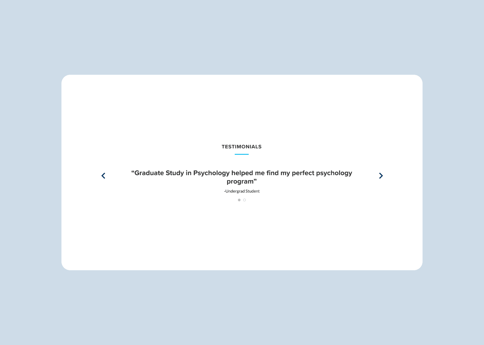
Testimonials were added to help people feel confident about their purchases.
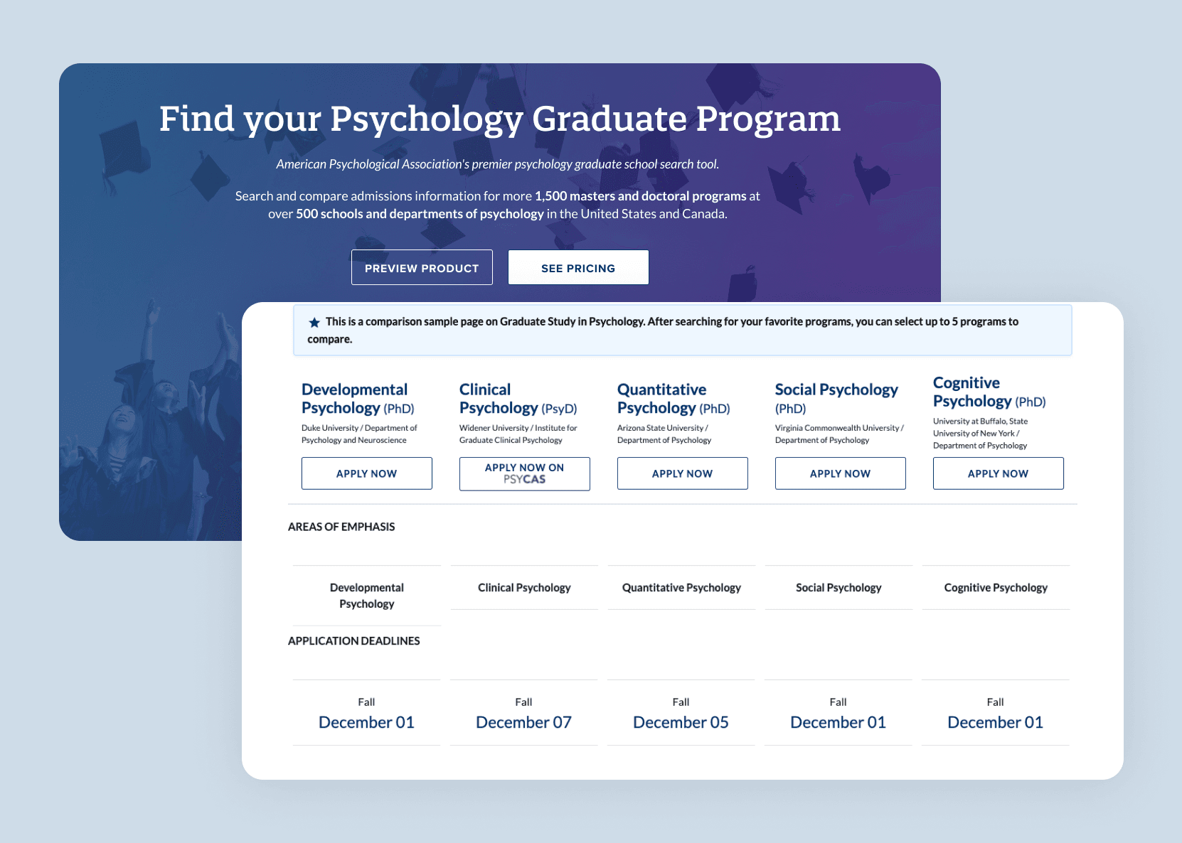
A preview page of the tool was added to give potential users an inside look at the product.
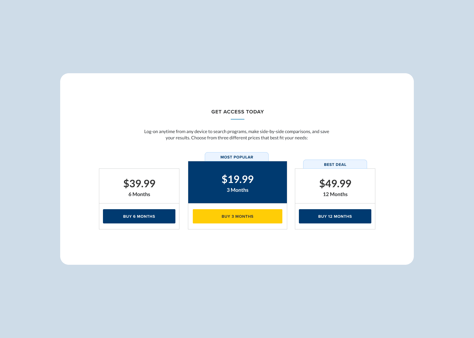
The pricing buttons were converted to a pricing table and pushed to the bottom of the page. Doing this allowed people not to feel so rushed to buy and instead get to understand the product more.
Conclusion
These UX optimizations helped increase sales by solving our original problem: How can we effectively communicate the tool’s value and encourage a more confident purchase? These changes helped increase the number of new users on the platform compared to the previous year.


